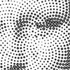
“In the heart of a sunflower’s embrace, its seeds weave a poetic tale—a dance of two spirals, parastichies they’re called. One unfurls gracefully from the center in the hush of clockwise whispers, while its counterpart whispers secrets in the tender breaths of counterclockwise motion. A subtle ballet unfolds, where the number of these spirals gracefully mirrors the whispers of adjacent Fibonacci numbers, composing a delicate symphony in the sun-kissed fields.” […]
Posts with the keyword pattern
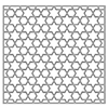
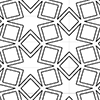
Here are the variations of classical six-pointed star patterns generated by Grasshopper. Generally, you can see these patterns under the title “Islamic patterns” because they are frequent in the decorations of mosques and palaces. I studied these patterns in Grasshopper earlier in these posts. I always find this an interesting geometry exercise. This time, my main goal was to develop a useful code only with the native Grasshopper components that […]
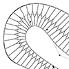
This project was about a unique tiling pattern inside a multi-story residential building’s hallways in Grasshopper. While drawing the construction documents of the project, it was necessary to apply some coding here, as each floor had a different shape to be tiled. The problem statement included one sketch with a zigzag-shaped tiling pattern. Thus, I tried to implement this pattern on multiple floors with different shapes. I call this definition […]
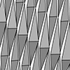
This is the continuation of a very old parametric model of a building facade, presented here. I will introduce the basic Grasshopper definitions of several alternative designs. The first one is the rhombus facade. The first part of the algorithm deals with the necessary data collection. We reference a polyline from the Rhino model as the path that the facade will follow. After that, we create vertical lines around the […]
This is the six-pointed star lattice definition in Grasshopper. The definition is generating CNC or laser-ready results as seen below. In this code, first, I developed a common star pattern by exploding a hexagonal grid. The tricky part of this definition is the last part. There, you can see how you can use the Region Union (RUnion) component to add thickness to a pattern we have drawn before. The operation […]
This is my first experiment on developing add-ons for Grasshopper. There are two components in the “Parquet Deformations” add-on. These are the ghuser files coded in Python. So, they can work by just dragging and dropping to the Grasshopper canvas. These first two components of the toolset are more like helpers while designing Parquet Deformations. I introduced some of my re-generations of classical parquet deformations here and here and in […]
This is the continuation of the physical prototyping project of a folding pattern from 9 years ago. I simulate the folding pattern using the Rhino Grasshopper Kangaroo. As seen in the video, this is possible thanks to the pre-set hinge positions on the Rhino model. Thus, the folding motion can be animated on the screen. You can download and try the Grasshopper code. I often use this code in my […]
The Parquet Deformation named “Wiry Wonder” was designed by Michael Cuttita in William Huff’s studio at the State University of New York in 1989. The below figure shows the original drawing made by the student. Similar to the previous one, this composition is based on a hexagonal lattice. In this composition there are three significant prototiles, marking the three key moments in the shape-shifting process. There is also one invisible […]
“Strange Start Startling Stop” was designed by Mary Purdy at the State University of New York in 1985. The composition is based on a hexagonal lattice (above figure). There are four prototiles, marking the four key moments in the shape-shifting process. The first prototile is a regular hexagon, which is also the first tile of the composition. This prototile morphs into a shape that is a composition of four smaller […]
I will try to explain the student project called KUKABAE that was developed in my Robotic Fabrication elective course in 2018. This was a very interesting project. Initially, the students were doing the design to attach an ordinary pen holder to the robot. but then the project changed by chance. they decided to replace a pen holder with a ceramic knife. As seen in the video and pictures, the relationship […]
One of the new assignments of our Computation-based Basic Design studio is called “Self-Organizing Patterns”. Although I’m not very sure about their self-organization potential, there are several good examples of systematic pattern-making. In the third week of their design education, some of the students proved themselves very well in analyzing and re-configuring natural structures in 2D abstract compositions. Selina Şişik Kardelen Kurt Sude Aydın
This is the first assignment named Design in the Forest of the new “Computation-based Basic Design” curriculum at İstanbul Bilgi University Faculty of Architecture. We are excited to see the students merging their conceptions of natural structures with the skills they start gaining in geometry classes. In the next assignments, we expect to generate patterns and structures by the abstraction of these initial sketches. Humay Aliyeva Sude Akay Here is an […]
The Cut & Fold & Craft exercise is the mid-term project for last year’s Computation-based Basic Design Studio at İstanbul Bilgi University Faculty of Architecture. I really enjoyed the technique called Kirigami. Most of the projects are not flat-foldable but they are all cut from a single sheet of paper. This technique seemed a little bit limiting at the beginning, but the students managed to design very interesting compositions in […]
Here is the abstract of my last publication in the International Journal of Architectural Computing. Parquet Deformations is an architectural studio exercise of William Huff in the 1960s. It aims to improve students’ reasoning of spatiotemporal variation by utilizing sequential shape-shifting of patterns. This article examines the outcomes of this educational research from the perspective of design computing. A multilayered reading about the exercise will reveal its historical, theoretical, and artistic backgrounds. Then […]
Here is one of the exercises I tested with a few students in Architectural Geometry. The exercise is about creating Escher-like patterns. It is an introductory topic on the designerly utilization of regular tessellations. We use square, hexagonal, or triangular tessellations as underlying structures of complex patterns. Below are some of the student works from this exercise. I think the black-and-white coloring helps in terms of reducing the requirements. Although […]
This exercise was a popular one in the 2015 and 2016 Architectural Geometry classes. Recently, I found these images of student works. However, some of the students’ names are missing (please e-mail me if one of them is yours). I love this exercise because it is a quick and efficient way of explaining and experimenting with the workflow of digital to physical production. In this particular exercise, students created Rhino […]
This quick project was about a special tiling pattern inside a multi-story residential building’s hallways in Grasshopper. While drawing the construction documents of the project, it was necessary to apply some coding here, as each floor had a different shape to be tiled. Although it is not a real Herringbone tiling, I named it because I couldn’t find a better name yet. First, I’ve imported the geometric boundaries and the “middle curves” […]
Again, we revisited the seamless patterns exercise this semester. This is one of the main exercises of architectural geometry class. We expected to improve students reasoning on generative patterning while they explain their processes step by step. The key element of this exercise is the usage of compass and ruler constructions. However, we didn’t keep this rule limiting their creativity too much. In this activity, we tasked students with developing a personalized […]
Inspired by this cut-fold pattern, we developed a prototype with Fulya Akipek. The first experiments were made from 3mm thick foamboards and they worked very well with 50×70 plates. However, when the project gets bigger and bigger, we needed to add a joint detail and use 5mm thick foamboards to achieve our goal (that is to develop a 1m by 2.5m shutter system). Then, we tried to animate its folding behavior by […]
Here is a good brief explanation by Mark Garcia on how patterns re-emerged in the digital age after Modernism and Postmodernism. …In the 1980s and 1990s, Postmodernist patterns predominated, and especially those of Robert Venturi, Rem Koolhaas, Stan Allen and Sanford Kwinter (fields), along with historicist, folding, sprawl, cross-programming, high-density/proximity, non-places and other Deconstructivist and high-tech patterns. In 1992, Henri Lefebvre’s last book Rhythmanalysis: Space, Time and Everyday Life was […]

