Swirly Flames
One of the main requirements of being successful in the field of digital design seems to have nice high-tech background images. Usually, it contains different kinds of nebula-like grids, plastic-explicit, and/or combinations of curves-surfaces-and-numbers, burnt by a couple of photoshop filters. If you have the right background, this means you are ready for a workshop, a book, or a presentation. (just joking) However, I love these, and cannot stand more than 1 minute working for them. So, here is what I found ten years ago while preparing a portfolio. This way, you can create a couple of possibilities in just a few seconds;
1. Open a blank sheet in photoshop, select the gradient tool with any color you want (or just black to white),
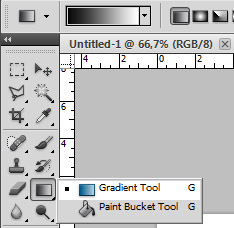
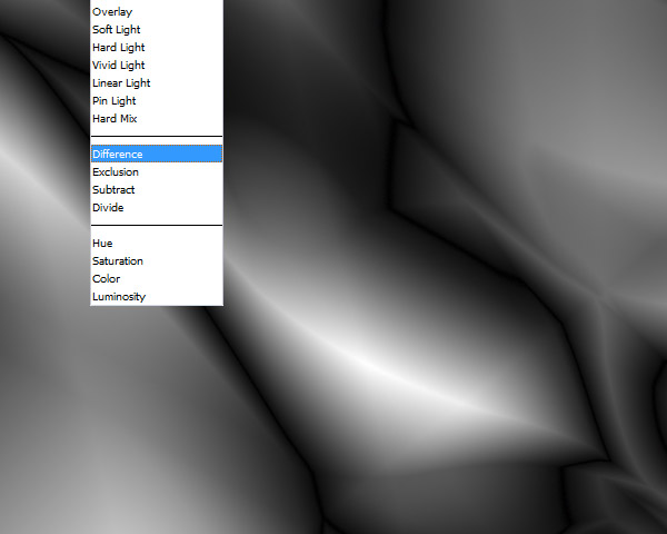
2. Choose “difference” as the “mode” of gradient (this is very important) and paint the sheet with it however you want. Also, try other types of painting such as radial and diamond gradient by selecting them from small buttons just left of the “mode” dropdown menu.
3. Now run the photoshop filter “find edges” (under “filter/stylize menu”) to create a pattern. Finally add “auto contrast”, “variations”, “diffuse glow” and/or any effect you want. (2023 edit) Unfortunately, the “Variations” tools were removed from Photoshop. You can use Hue/Saturation instead.
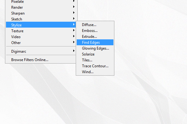
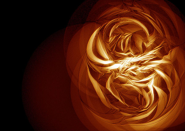
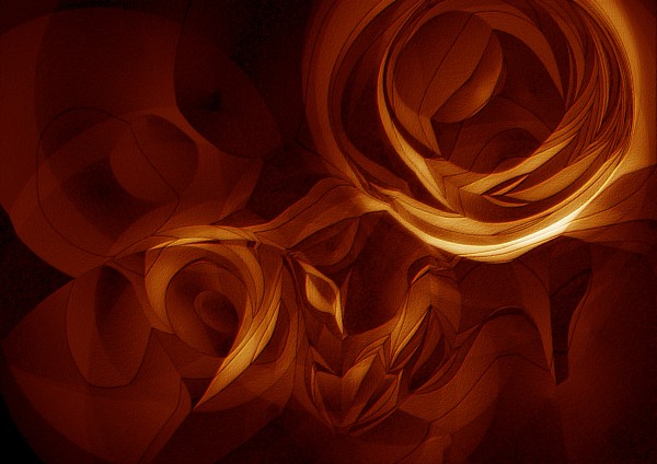
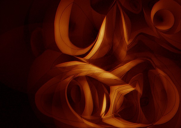
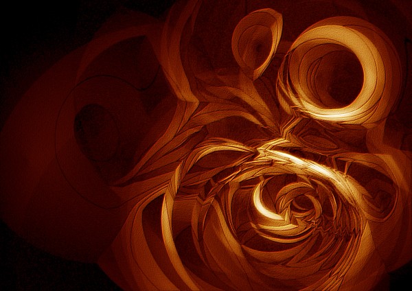
The “find edges” here create a grainy texture, lines, curves, and shadow-like surface effects altogether. I found this method accidentally when I misunderstood something else in a tutorial. It is interesting to see the effects of “difference” in the gradient process, every attempt creates very different results. I sometimes play with them, using different colors, and photoshop filters. However, I didn’t use them in any poster or workshop yet. That proves that the background does not elevate the content.
Click on the below images to see them closer.

